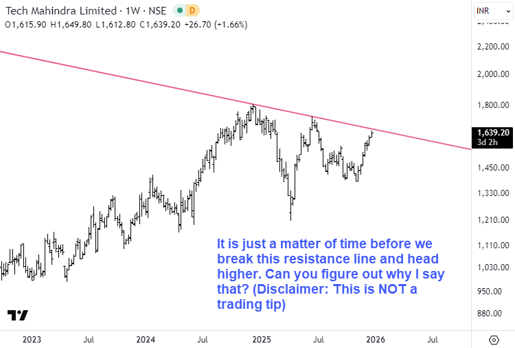
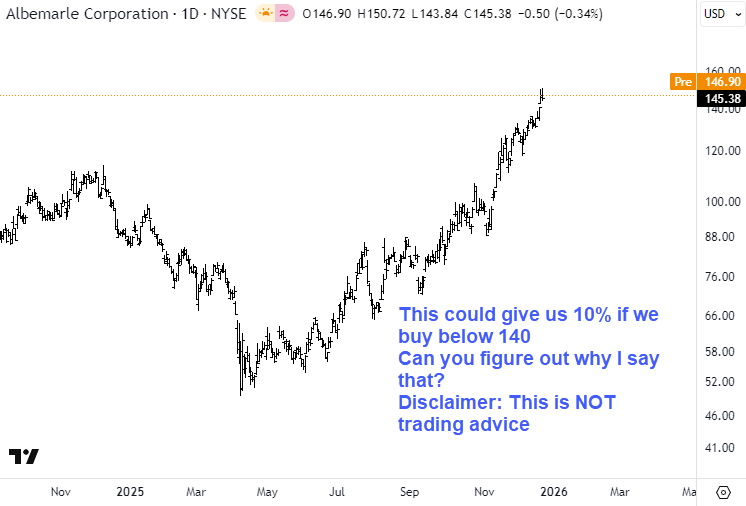
This post looks at two stock charts to highlight different ways in which underlying strength can assert itself within an uptrend. In the first example, repeated tests of a declining trendline from progressively higher lows offer an important clue about pressure building beneath resistance. In the second, the price structure points to the development of a strong third wave. While the market context has since changed, the patterns discussed here remain useful as learning examples for understanding trend behavior and wave structure.
I am giving you two charts below. One is from India’s NSE and the other is from NYSE. | | |
|